Make sure everyone is viewing the same reference
Screens vary by device and setting, while printed color is also shaped by the stock and its surface. For a critical color, state whether the target is an approved physical piece, a designated color sample, or the current proof.
If an earlier production sample is the target, provide one that is well preserved and representative of the desired result. A photo sent through a messaging app is rarely a dependable basis for judging subtle color differences.
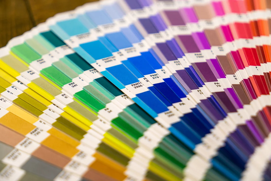
Describe the area and the direction of change
Identify the exact page, color block, or image area, then say whether it should be lighter, darker, warmer, cooler, or less saturated. This gives the production team a clearer action than a broad comment such as “it does not feel premium.”
Also distinguish fixed brand colors from image areas that allow some adjustment. With priorities visible, the team can address the elements that matter most to recognition first.
Judge color with the stock and finishing in mind
The same artwork can vary in brightness, saturation, and sheen across different paper surfaces. Lamination and other surface treatments can further change how the finished piece looks and feels.
Color approval should therefore reflect the intended material and process. Yinjia operates a Fujifilm CTP system and Heidelberg CD102 and KBA RA105 multicolor offset presses, providing a factual starting point for project-specific prepress and print discussions.
Bring these ideas into your next project.
Arrange a sample discussion